The Q3 and Q4 of 2018 were pretty exciting for MVP Workshop’s design team, with NEO Creative Design Competition being one of the projects we decided to take on.

This world-renowned blockchain project hosted a community-based challenge where our design team had an opportunity to come up with a solution for improving visual communication on the website and creating a concept for NEO ecosystem visual style guide, including icons.
Let’s go through some of the work and discuss the approach in detail.
The Concept
Our primary aim was to preserve the existing NEO brand that is already quite distinguished in the industry. However, we wanted to present it in a more futuristic, powerful, and attractive manner.
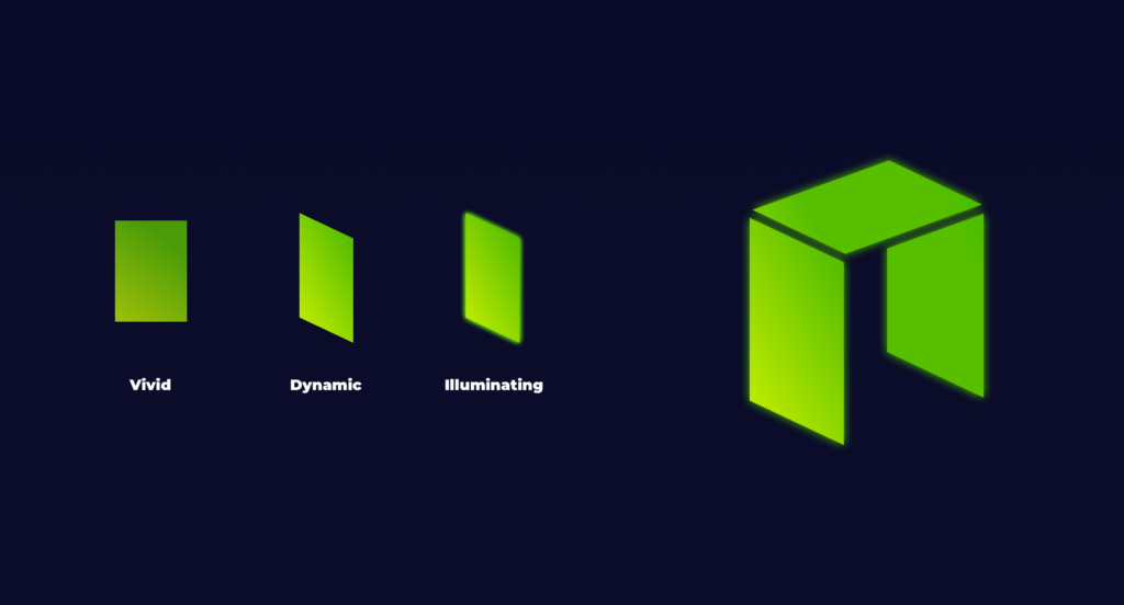
First, we decided to use a specific green color gradient that is already associated with NEO. This shade was used for the most important elements in the solution since we understood its importance, as well as the ability to grab users’ attention and convey a strong, attractive, yet clear message.
Since the logo is based on an isometric projection that communicates a dynamic, agile, and visionary brand, we decided to apply this approach to all visuals, so as to invoke a sense of futurism and progress in viewers’ minds.
Finally, the glowing effects combined with a dark blue background make the brand powerful and unique, instantly capturing users’ attention.
Illustrations
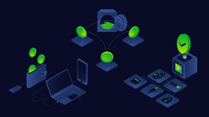
Using an isometric illustration style was a natural choice, as existing brand aesthetics would be preserved with that approach. Furthermore, users associate isometric aesthetics with the concept of a smart economy, where this method is used to express certain highly technical and abstract concepts visually, such as smart contracts and virtual machines.
Style
In order to maintain brand recognition, we decided to keep the primary colors and gradients as they were. However, the way colors are used differs as their contrast is increased, especially with shades of blue (dark and pale) that are utilized so as to complement the main vibrant color(s).
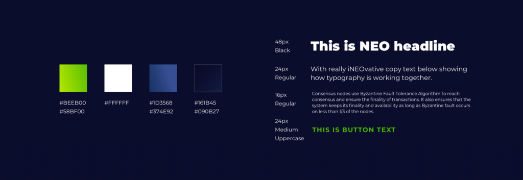
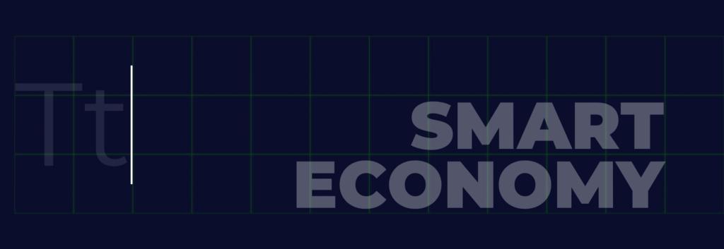
Deciding on which typography to use was also an interesting task. In the end, we settled for Montserrat typeface family, which is a very versatile typeface with different weights and geometry-based structures, giving off a dynamic, stable, and powerful vibe, especially recognizable in the NEO logotype.
We used the Black weight for headings and navigation, which complements regular weight for the copy.
Grid and Vertical Rhythm
We used a full-width 12-column grid, a vertical 4px (or 0.25rem) rhythm based on a 24px (1.5rem) font size, and a 32px (2rem) line-height.
Layout
Home page consists of six sections, with each section focusing on a separate theme. Furthermore, each section has a full-screen size, which allows users to pay attention to the content. In other words, we designed the home page to be a storytelling medium, introducing all important features and details related to the NEO project.
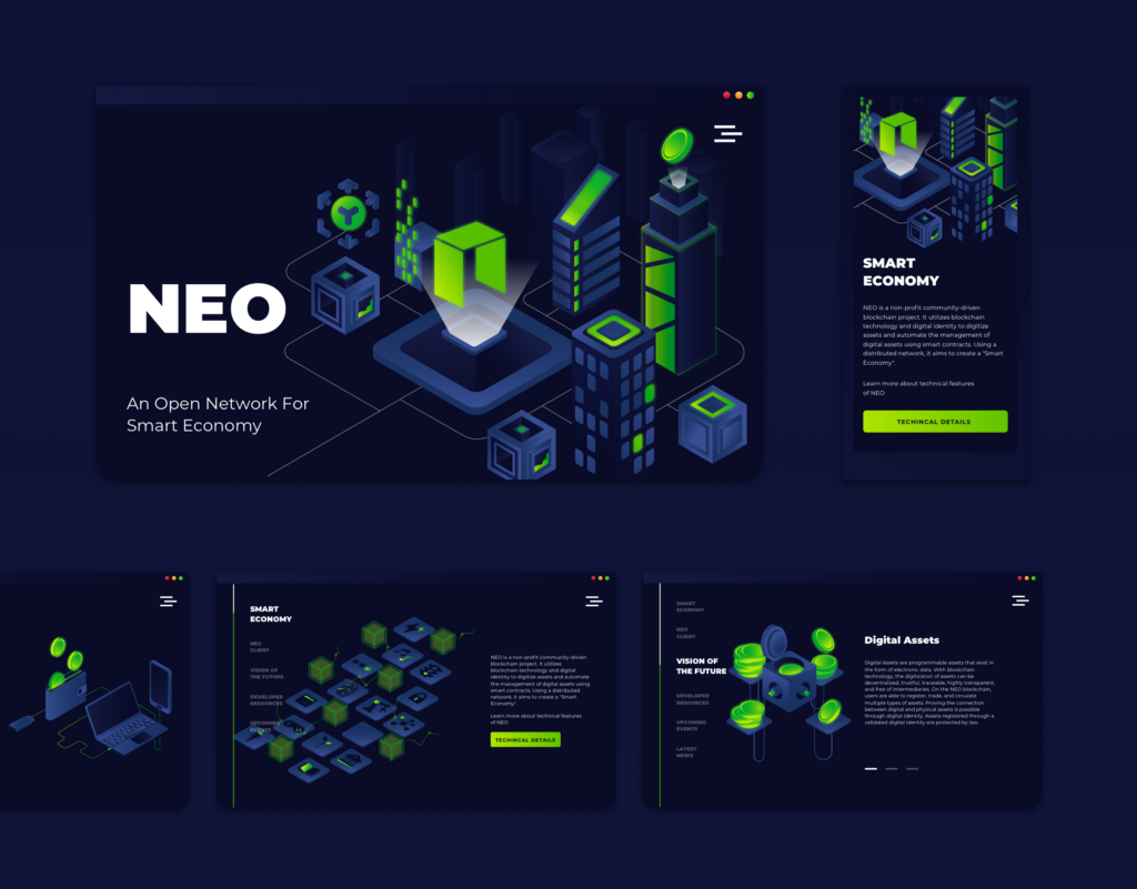
Two Alternative Navigation Options
Two navigation options are available within the same theme and template:
- The primary navigation contained within “burger menu” with on-page navigation that displays users’ current position on the home page and their reading progress.
- Regular top header navigation that switches to burger menu under 960px.
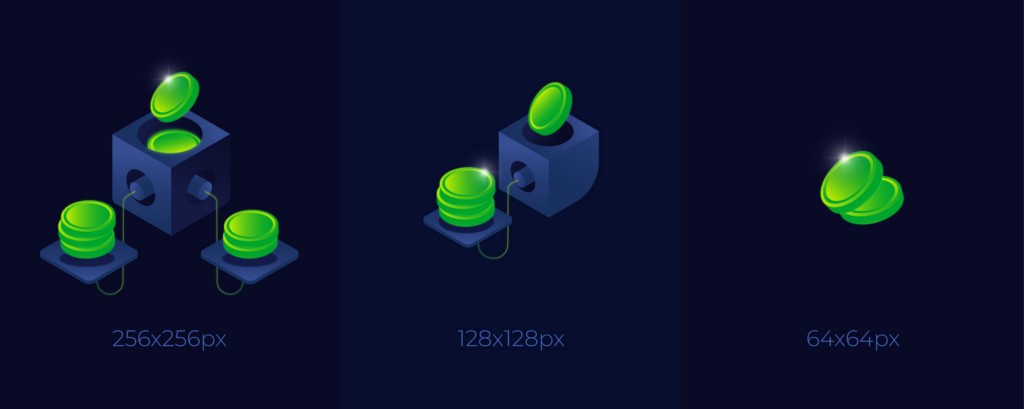
NEO Ecosystem Icons
The design competition also included designing key NEO ecosystem concept icons (NEO Contract, NEO Asset, NEO FS, NEO VM, NEO Identity, NEO Gas, and NEO QS). Our work was focused on creating icons that are scalable, visually appealing, and compatible with the existing design on the website.
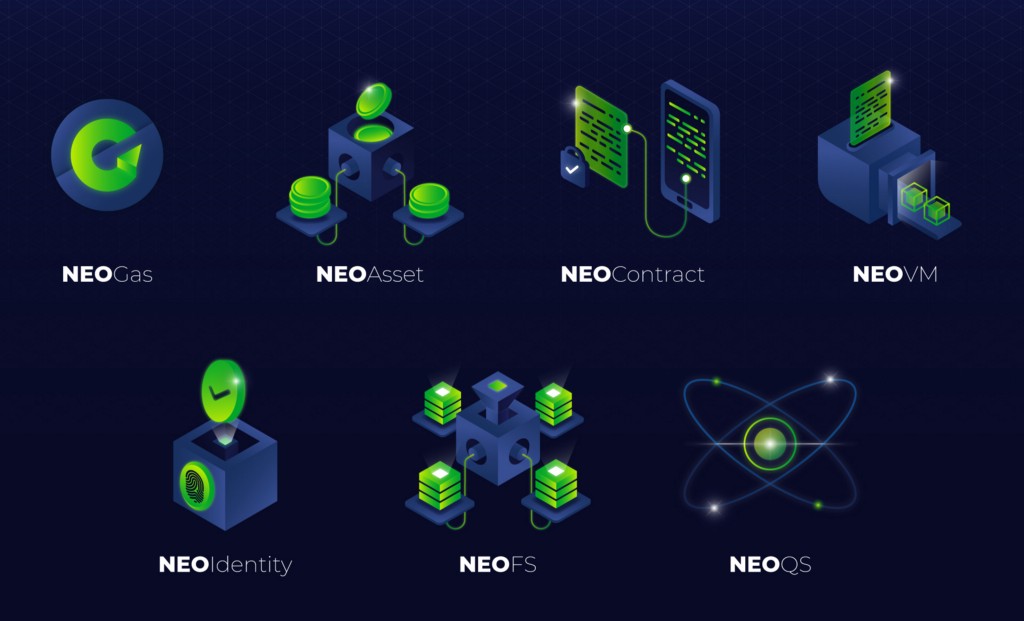
Being clear and distinguishable in all sizes, these icons can be used for various purposes. In other words, whether used in a tiny format or as a detailed logo, the icons will be recognizable and users will associate them with NEO.
Final Thoughts
We entered this competition hoping to contribute to the blockchain design community and challenge our day-to-day routine. As we made an extra effort, that contribution definitely paid off — we have received positive feedback from the NEO community on our design approach. Moreover, our team managed to create even stronger bonds and learn a couple of important things along the way.
Visit our website in case you are interested in learning more about our design team. Follow us and subscribe for more updates such as this one, and feel free to join the conversation on Twitter and LinkedIn.
For free business consultation about how blockchain can impact and change your business model, or anything else related to the technology — get in touch with us.


MVP Workshop’s Contribution to NEO Design Challenge: an Overview of Our Approach was originally published in MVP Workshop on Medium, where people are continuing the conversation by highlighting and responding to this story.